- Download count 2135
- Pageviews 3123
- Unique foldername pm_shrine
- Skin for
- Track Mod for
- Based on
- Release date 2022-03-13
- Version from
- Version
- RVW-ID 31850
- Category Standard Track
- Score
- Unconventional car?
- Construction
- Engine
- Transmission
- Top speed mph
- Total weight kg
- Acceleration m/s²
- Construction 3D Modeling (Original)
- Track difficulty Medium
- Track length 660 m
- Reverse version available? Yes
- Time trial times available? No
- Practice mode star available? No
- Online multiplayer compatible?
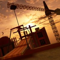
My first track, also made for the event.
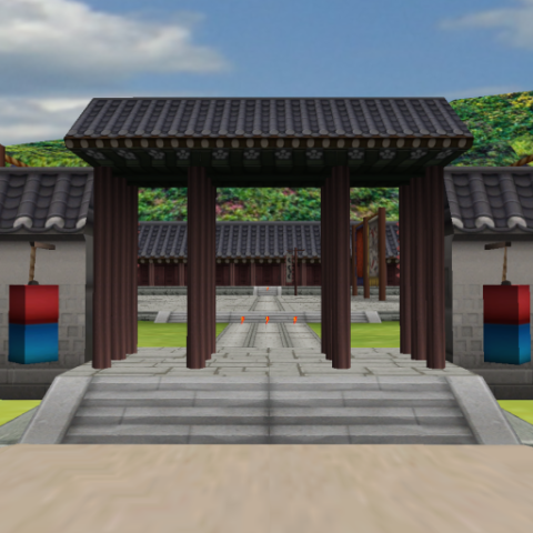
It was made based on 'Jongmyo', one of the famous historical sites in Korea.
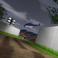
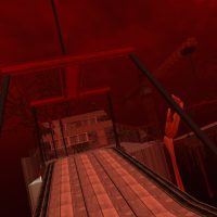
In the reverse direction, there is a gimmick of changing the weather



 62/100


This track may not be the most complex, but I like it. It allows cars with a very high top speed to really stretch their legs, and the low-speed turns help to balance it out better than some tracks which are just full throttle all the way. it’s a great replica of the real shrine, as well.
This track is very, very beautiful, one of my favorites. In general, I like tracks with beautiful nature. It’s very easy because the roads are wide, but it’s an advantage because you can drive and enjoy the scenery. I appreciate it.
I am not a track guy by any stretch of the imagination, but I figured I’d leave a comment under this track, and I got reminded because Paperman released his second one just today.
I was very thrilled to see such a well known car maker try his first venture into tracks, and the WIP shots looked very promising. The track itself is visually great – but that’s it. The raceline contains enormous, super long straight connected by 90° turns, with a single RIDICULOUSLY NARROW pathway near the actual shrine that just breaks the flow. It already makes for enough carnage when used for offline single races, I don’t even want to imagine what would happen online in that part of the track with lag and everything.
I get it – you wanted to go for the realistic proportions and architectural accuracy of the individual parts, but there’s more than that to an enjoyable RV track. The sheer size difference between the “road” parts and the shrine part just makes the raceline not work at all.
Tubers’ idea of converting it into a stunt arena (if ramps and other similar things get added in the grassy area, that is) might be the only real way to salvage such a creation without having to rethink the whole road/raceline layout, IMO.
I have to agree with you guys. Next to that, there are several problematic parts regarding the raceline. At a certain spot, you’ll get red x if you turn too close to the obstacle in corner depsite the car is still in the raceline. The direction arrows show up too late sometimes and the raceline itself not always clear.
Visuals are top-notch, but you should revise the Track Zones, AI & Pos Nodes, also the Triggers if you wish. It’s up to you of course.
What Tubers said, basically. Visually it’s very pretty and enticing – grass texture is too bright for me and stands out, but that’s just me. It’s obvious you’ve put a lot of work into the textures, and you can see it.
Racing line is, to be blunt, boring. I’ve tried the track out in Amateurs and Semi-Pro. In both cases first turn was a horrible mess because speed transtion is too sudden, and there’s literally no runoff. AI being there or not doesn’t make a difference, since even on time trial you have to choose between braking way too early or smashing into the temple. Then there’s the corridor that’s too narrow to race, and then back to two big, wide runways.
The track reminds me a bit of CART’s Cleveland GP. The layout itself could be hammered into something very nice indeed, with its many colliding paths and beautiful scenery. But none of that can work if everything’s flat and empty. That being said, it’s clear you’ve got good artist’s hand already, so if you work on technical aspects of tracks, I’m sure the next one will be much, much better.
This would’ve been better off as a stunt arena rather than a track itself, with more objects scattered around the area. It’s the first track by Paperman and in most cases, like mine, it has flaws that stand out. It’s not the graphics, far from it, it looks brilliant. But that’s it. There are long straights that are not interesting.
Don’t let this comment discourage you. Let’s hope the next track improves on the flow. Good examples of racing flow are White Rose Chapel, Home 2, and Jailhouse Rock. Extreme potential here. Good attempt though.